When I prepare a large embroidery order, I pay close attention to two things that can make or break the final look: the applique shape and the lettering around it. Good applique letters and fonts need more than a nice on-screen appearance, and an applique embroidery digitizing service needs to account for fabric, stitch direction, material thickness, and the design's actual size.
In my experience, the safest approach starts before digitizing. I look at the fabric, applique material, letter size, and spacing together instead of treating each part as a separate job. That small step usually prevents the uneven edges, overlapping lettering, and unnecessary adjustments that become much harder to fix when an order contains many pieces.
Why Applique Technique Matters in Large-Batch Embroidery?
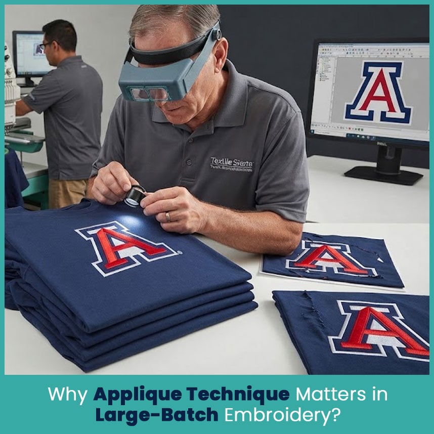
Applique saves stitches by using fabric to cover larger areas, but that does not mean the digitizing becomes simpler. The border still needs to hold the fabric in place, and the stitches need to work with the material underneath.
For a large order, consistency matters even more. If the first shirt has a clean edge but the next group shows gaps or shifting fabric, the design needs another look before more pieces are decorated.
I usually check these points before approving an applique design:
- The applique fabric should match the design size and shape.
- The edge stitching should have enough coverage to hold the material firmly.
- Stitch direction should support the shape instead of pulling it out of form.
- Lettering should have enough space around nearby applique areas.
- Small details should not compete with the main shape.
- The design should suit the actual garment fabric, not just the artwork on screen.
Fabric and Stitch Considerations for Consistency Across Batches
Different fabrics react differently when stitched. A lightweight shirt can move more than a firm jacket, while stretchy sports fabric can pull around a dense border.
The applique material matters too. Felt, twill, cotton, polyester, and specialty fabrics each behave differently under the needle.
For that reason, I do not use one stitch setup for every applique project. I consider the base fabric, applique material, design size, and border before setting the final stitch structure.
A few details deserve special attention:
- Stabilizer: The right stabilizer supports the garment and reduces movement.
- Underlay: Proper underlay gives the top stitches a stable foundation.
- Border coverage: The edge needs enough stitching to cover the applique edge cleanly.
- Density: Too many stitches can make a small area stiff and messy.
- Pull compensation: Slight adjustments can help borders maintain their intended shape.
Common Applique Mistakes That Slow Down Bulk Orders
Most problems I see are not caused by one major mistake. They usually come from several small choices that were missed during digitizing.
Common issues include:
- Choosing applique fabric that is too thick for the design.
- Making borders too narrow around small shapes.
- Placing lettering too close to the applique edge.
- Using heavy stitch density on an already thick area.
- Ignoring fabric stretch when setting the design.
- Making small letters too detailed.
- Skipping a sample check before the complete order.
A clean digital preview cannot tell the whole story. I always pay attention to how the stitches will sit on the actual garment.
Choosing the Right Applique Method for Scale
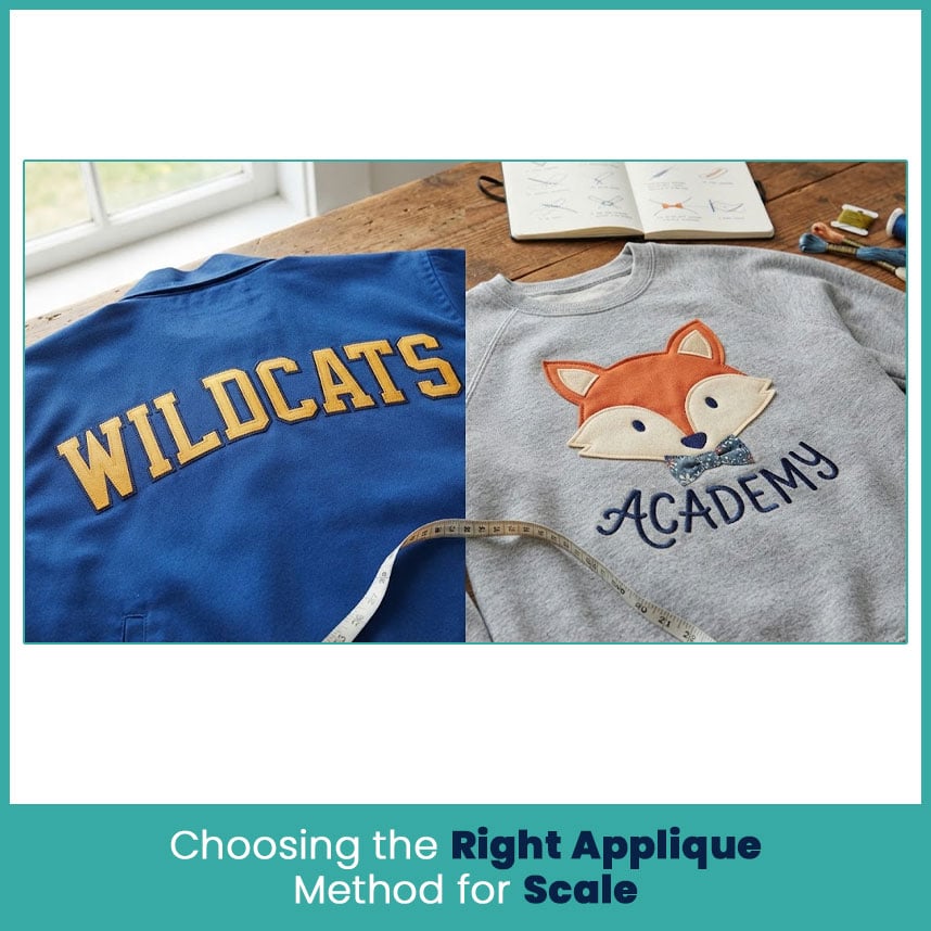
The right applique method depends on the look, garment, material, and size of the design. Two common choices are tackle twill and fabric applique.
Tackle Twill vs Fabric Applique for Bulk Work
Both methods can produce strong results, but they suit different types of artwork.
When Tackle Twill Makes Sense
Tackle twill works well when the design needs a firm, clean shape. It is common in athletic lettering, team logos, jackets, uniforms, and other garments where bold shapes matter.
I like tackle twill for larger letters and simple logos because the material gives the design a defined edge without requiring heavy stitching across the entire area.
It makes particular sense when:
- The design has bold shapes.
- The lettering is large enough to read clearly.
- The garment needs a strong athletic look.
- The applique material needs to stay flat and stable.
- The artwork does not contain many tiny details.
When Fabric Applique Makes Sense
Fabric applique gives more freedom with color, texture, and visual style. It works well for decorative logos, school designs, children's garments, brand marks, and artwork that needs a softer fabric-based appearance.
With fabric applique, I pay extra attention to the edge because even a small shift can change the appearance of the finished shape.
Fabric applique works well when:
- The design needs several fabric colors.
- The artwork has larger open shapes.
- A softer visual appearance fits the garment.
- The fabric itself contributes to the design.
- The applique shape needs a custom material or pattern.
Font Pairing Basics for Embroidered Logos and Text
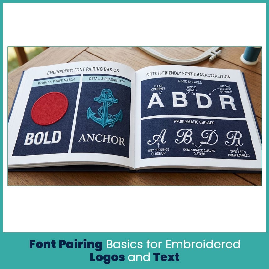
Font choice becomes more important when letters sit beside or inside an applique shape. A font that looks excellent in a graphic program may become difficult to stitch once the letters get smaller.
The goal is simple: the lettering should support the applique instead of competing with it.
Matching Font Style to Applique Shapes
Start by looking at the shape of the applique. A bold geometric shape usually works better with a simple, strong letterform. A decorative applique may need cleaner lettering so the complete logo does not become too busy.
I usually compare three things:
- Weight: Heavy applique shapes need lettering with enough visual strength to match.
- Shape: Rounded applique artwork usually pairs naturally with softer letterforms.
- Detail: Detailed applique needs simpler lettering to maintain readability.
This approach keeps the design balanced without forcing every element to have the same style.
Stitch-Friendly Fonts That Digitize Cleanly at Scale
Some fonts have tiny openings, narrow strokes, or complicated curves. Those details may look fine at a large size but become difficult to reproduce in thread.
For bulk embroidery, I prefer letterforms with:
- Clear openings inside letters such as A, B, D, P, and R.
- Simple curves.
- Strong vertical strokes.
- Enough space between characters.
- Limited decorative details.
- Shapes that remain recognizable after stitching.
The phrase applique fonts may sound like a special font category, but the real issue is whether the chosen letterforms work with the applique shape, size, fabric, and stitch structure.
Pairing Two Fonts Without Losing Readability
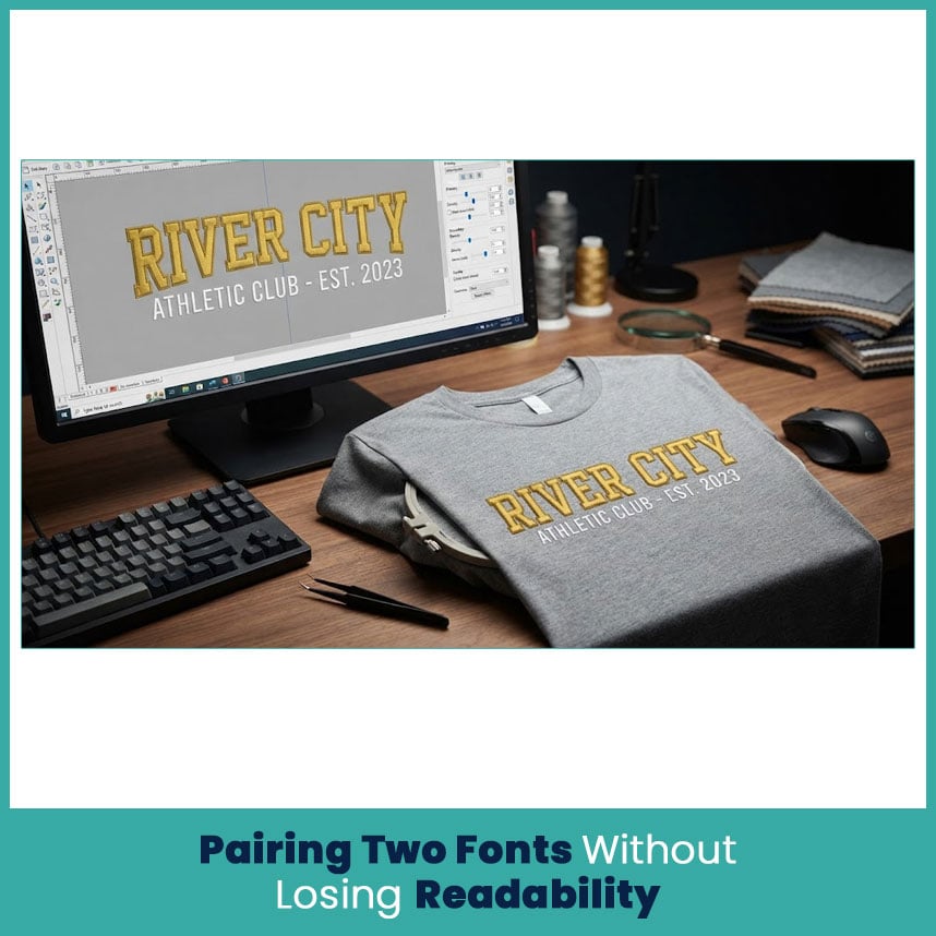
Using two fonts can give a logo more character, but more fonts do not automatically make a design better. In most cases, two carefully selected styles are enough.
Primary and Secondary Font Roles
Give each font a clear role.
The primary font should carry the main name, word, or message. It needs enough visual weight to stand out.
The secondary font can provide supporting information, such as a location, year, team name, or short phrase.
For example, a bold block font can handle the main organization name while a simpler condensed style handles the smaller supporting text.
I avoid pairing two highly decorative fonts because both compete for attention. A strong primary font with a quieter secondary font usually reads better.
Size and Spacing Rules for Small Text on Bulk Orders
Small lettering needs special care. Thread does not behave like ink, and tiny gaps can close once the design reaches the garment.
When working with small text, I check:
- Letter height.
- Stroke width.
- Space between characters.
- Space between words.
- Distance from the applique border.
- Fabric thickness.
- Stitch density.
If the text becomes too small, simplifying the letters usually works better than adding more stitches. Clear lettering matters more than keeping every tiny detail from the original artwork.
Digitizing Workflow for Consistent Results Across Every Batch
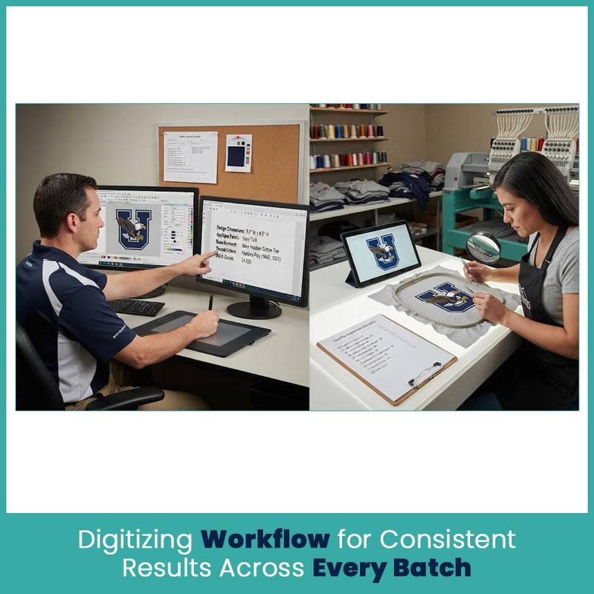
Consistency starts with a repeatable setup. I keep the main design elements organized so changes do not affect the entire layout by accident.
Setting Up a Font and Applique Template
A useful template should include the main applique dimensions, lettering sizes, spacing guidelines, color order, and basic stitch settings.
Before digitizing, I record:
- Finished design width and height.
- Applique material.
- Base garment fabric.
- Main and secondary thread colors.
- Lettering sizes.
- Border type.
Placement information.This gives the digitizer a clear reference instead of leaving important details open to guesswork.
Quality Checks Before Sending Files Out
A visual check should happen before the file reaches the customer or embroidery team.
I normally inspect the design for:
- Loose or exposed applique edges.
- Messy letters.
- Uneven borders.
- Poor stitch direction.
- Excessive density.
- Unnecessary trims.
- Incorrect color order.
- Small text that may lose clarity.
- Design dimensions that do not match the requested size.
A stitch simulation can help identify problems, but I also compare the final design with the original artwork. Both views matter.
Working With a Digitizer to Keep Bulk Orders on Track
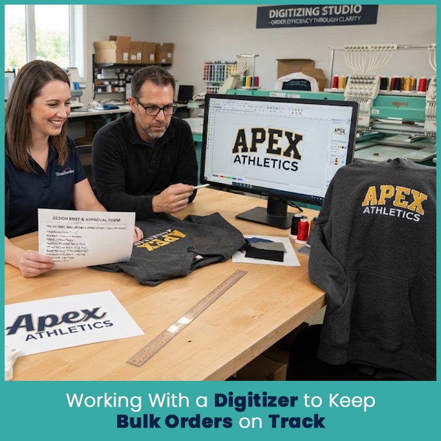
Clear communication saves a surprising amount of time. When a customer sends only a logo and says “make it work,” the digitizer has to guess about size, fabric, applique material, lettering, and placement.
A short but complete brief removes much of that guesswork.
What to Include in a Brief for Applique and Font Work
Give the digitizer the details that affect the finished design:
- Final design dimensions.
- Garment type.
- Fabric type.
- Applique material.
- Desired thread colors.
- Exact wording.
- Preferred font style.
- Placement.
- Any size limits.
- Reference artwork in the clearest available format.
If you have a specific letter style in mind, include a visual reference. A font name by itself does not always communicate the exact appearance you want.
Avoiding Revision Delays on Large Orders
For a large order, approve the design details before sending the complete artwork for digitizing.
I recommend confirming the following early:
- Final spelling.
- Logo proportions.
- Applique material.
- Font choices.
- Letter sizes.
- Thread colors.
- Garment type.
- Placement.
- Final dimensions.
Once these details are settled, the digitizer can build the design around the actual requirements instead of making repeated changes later.
FAQs
1. What is the best font pairing for embroidered applique logos?
A bold, readable primary font paired with a simpler secondary font usually works well. The best combination depends on the applique shape, letter size, garment fabric, and overall logo design.
2. Can applique and font work be digitized together for bulk orders?
Yes. Combining them in one digitized design helps control spacing, stitch order, borders, and the relationship between the applique shape and lettering.
3. How many fonts should one embroidered design use?
Two fonts usually provide enough contrast without making the logo look crowded. A single font can also work very well when the design needs a clean, unified appearance.
4. Does applique technique change for small text versus large lettering?
Yes. Small text needs simpler letter shapes, careful spacing, and controlled density. Large lettering gives more room for detail and stronger applique shapes.
Author Bio
Matthew Davis
Senior Embroidery Digitizer
I'm Matthew Davis, a skilled embroidery digitizer with more than 15 years of practical experience. I specialize in logo digitizing, 3D puff embroidery designs, applique digitizing, custom embroidery digitizing, and working with difficult fabrics.
Over the years, I have worked with different fashion brands and production teams worldwide. I always share simple tips and useful techniques to help both beginners and businesses improve their embroidery work.